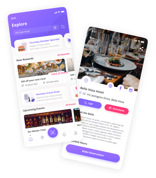
Reward Me elevates it’s customers' experience by keeping them up to date with exclusive offers and VIP events at all Momento Hospitality Venues.
With 40 years of experience in the industry, Momento Hospitality were looking for a way to unite their venues and elevate their customer’s experience. They approached us to create an application that puts the customer in the driver’s seat, giving them the ability to stay up to date on events and exclusive deals to all Momento venues.
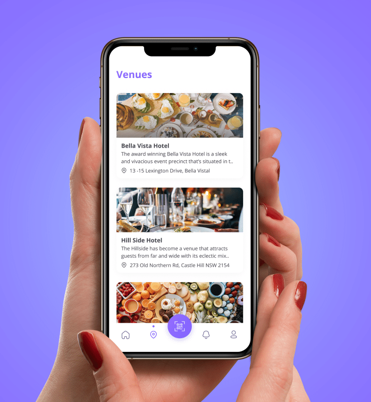
Reward Me provides new services including, customer access to member pricing and discounts, and access to exclusive offers and rewards across all venues. The app provides members with access to exclusive VIP events around Sydney and acts as a unique marketing tool to bring users back into their favourite venues.
From the project’s beginnings to the ongoing maintenance and support with the team, App Boxer were responsible for the brand identity, creation and implementation of wireframes to UI design, and the complete back end development of the application. The team has worked closely with the founder to continue to iterate and build upon the functionality and user experience based on feedback received from the launch of the initial MVP.
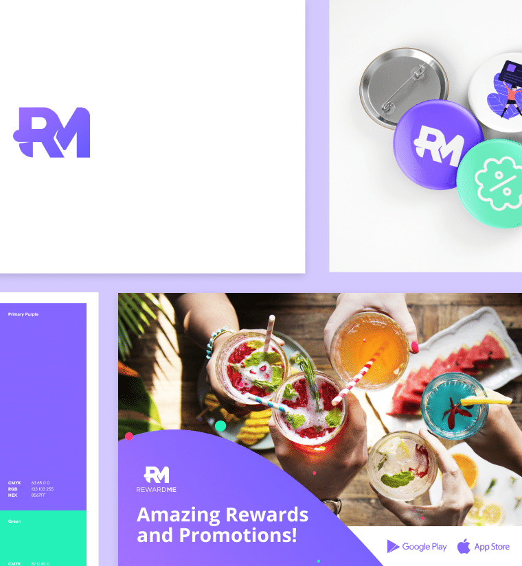
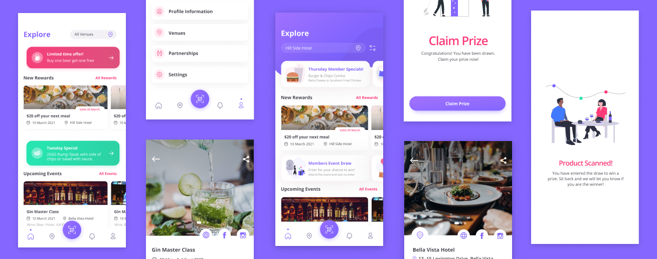
The visual approach was driven by the primary intention of giving an on-trend refresh to the entire brand and the app’s UI. We successfully made the key visual elements like CTAs, restaurant photos and typography more prominent and pleasing to the eye. The result is a clean and seamless UI design that not only appeals to a modern audience but enhances the UX.


The development for the Reward Me app required taking the analytics from multiple venues and seamlessly integrating that into a single app. It was built using React Native to run on iOS and Android devices with a Python Backend hosted on AWS. After the initial launch, we worked with the founder to take feedback and data from the user’s firsthand experience to reiterate the designs for phase 2. This included consolidating all the key features of the app into one single screen which allowed for a more seamless user experience.
Our focus was on improving the user experience, streamlining the onboarding process, adding features to the UI by adding a touch of animation to make the entire experience come to life.
